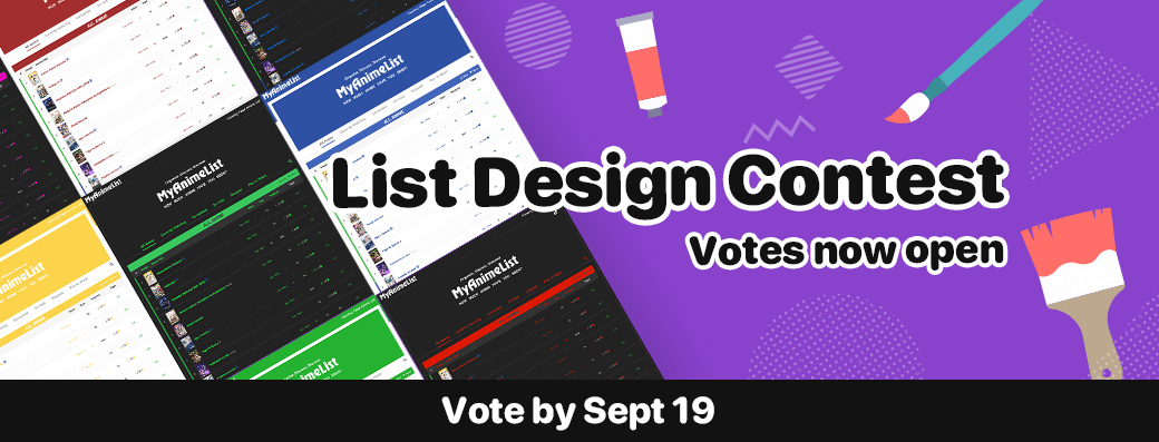
Modern List Design Contest Showcase
Modern List Design Contest Showcase
Published: Sep 12, 2022
Updated: Sep 12, 2022
New Layout
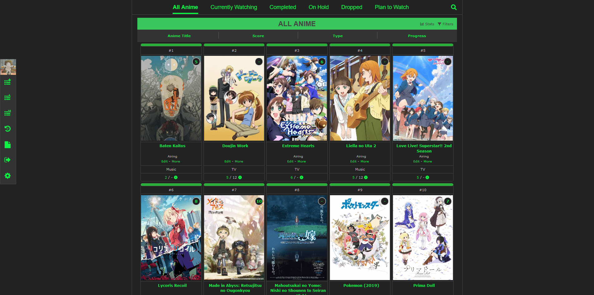 Modern Images
created by RobbiRobbA fresh take on the modern design. Making use of high-quality imagery, this take on the modern design brings the main picture into the center of attention. The score and episode count are easily accessible at all times, allowing for quick modification. It also leaves the user freedom which images they choose as header or background.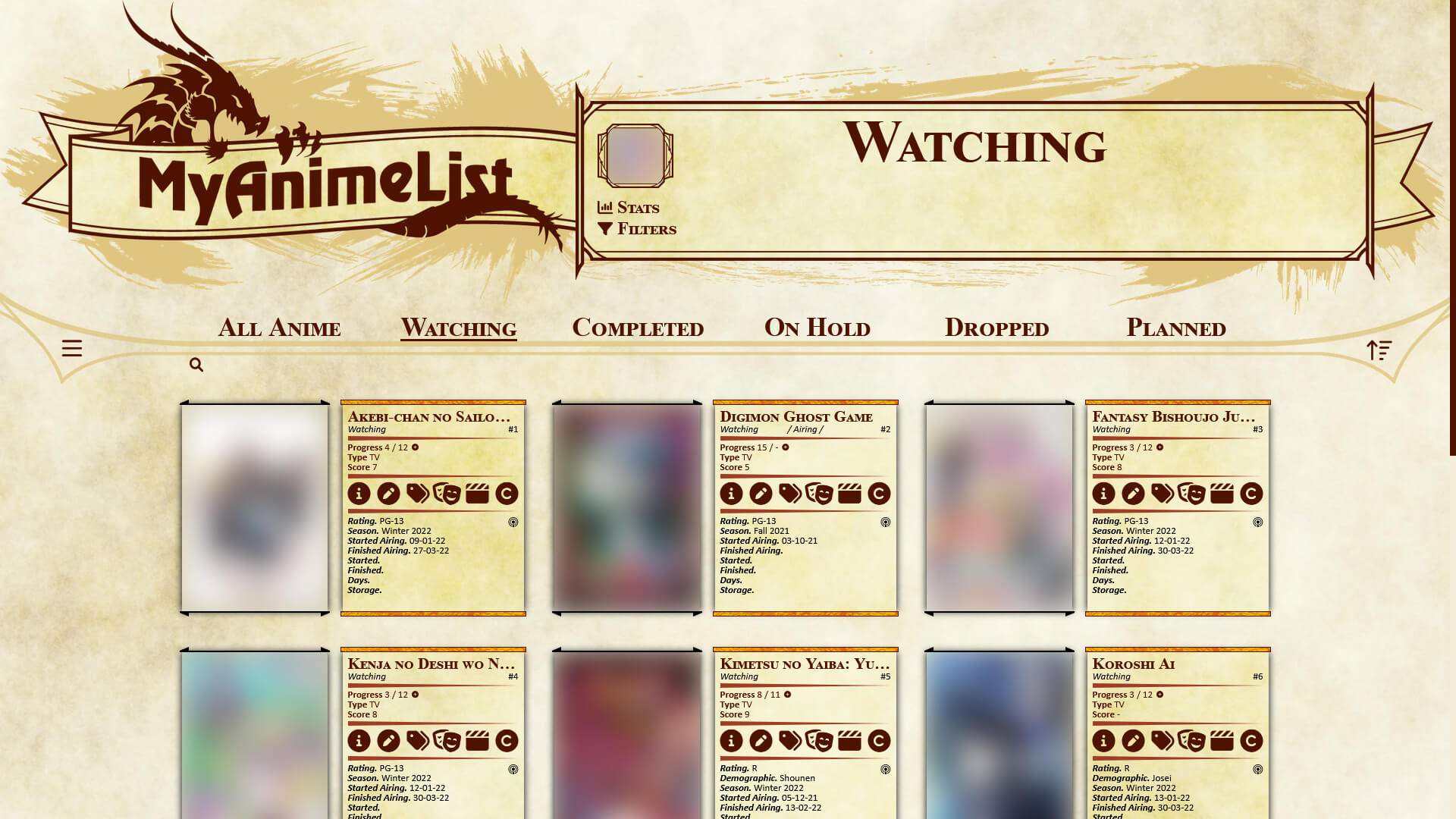 Dungeons & Dragons
created by Half_Bl00dLayout based on the Monster Manual and Character Sheet for Dungeons & Dragons 5e. Grid-type list with large images, that can fit all data (columns) and adapts based on which columns are turned on. The grid itself as well as the other elements adapt based on the screen resolution, so it's usable both on smaller and larger screens. Adapted for manga list as well.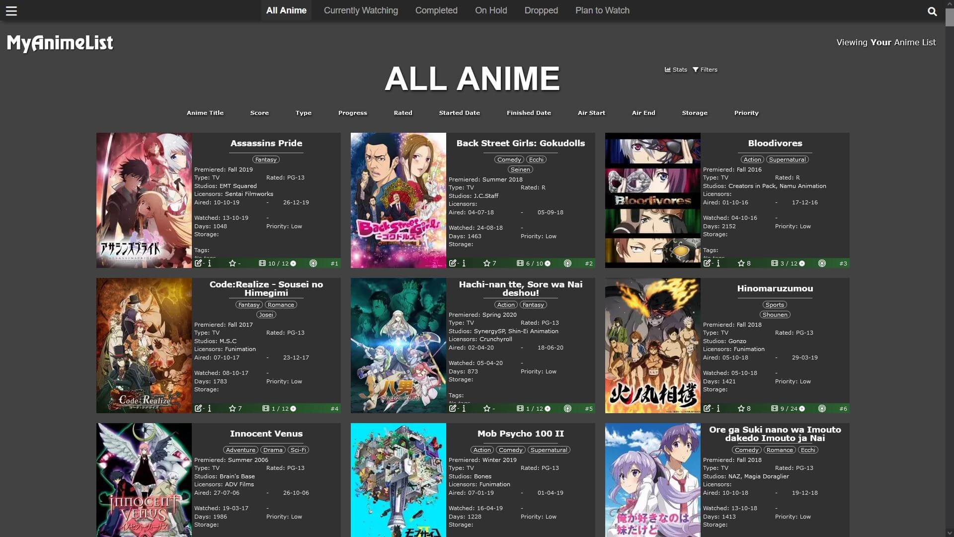 Night Shift
created by Cateinya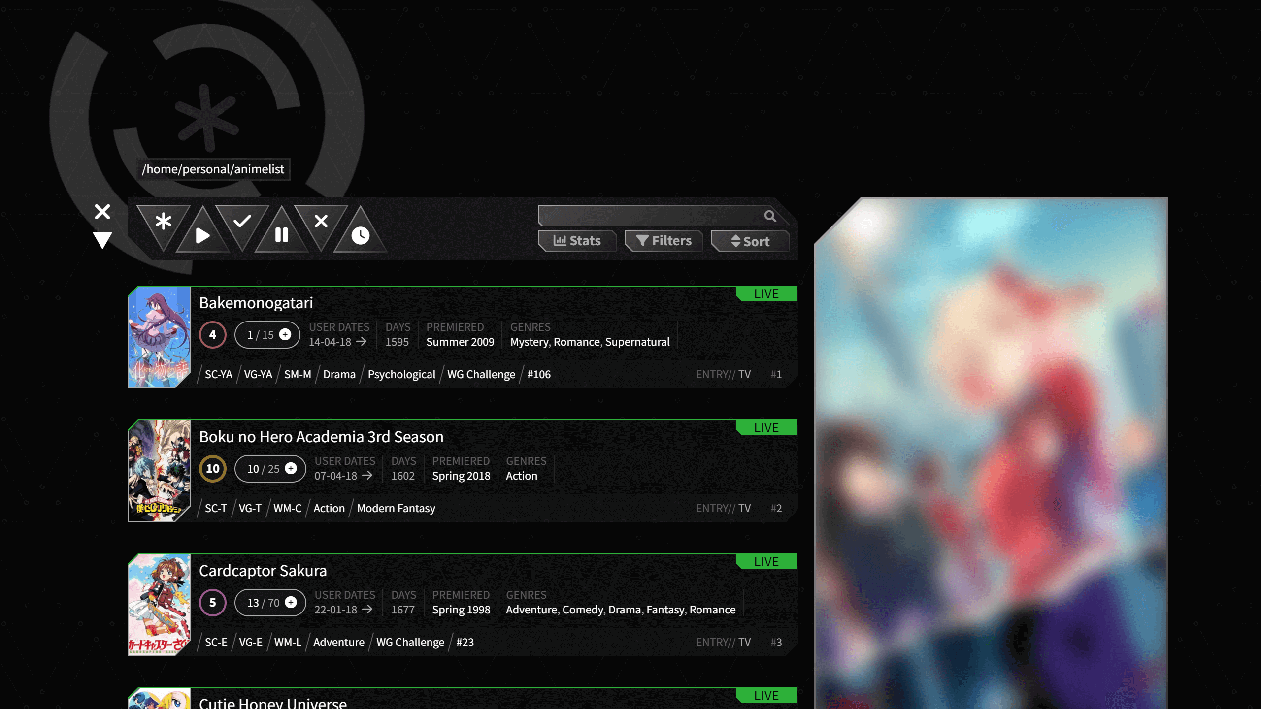 Blackout
created by Valerio_LyndonA dark and futuristic take on the regular anime list, with a completely redesigned page layout. The list itself is highly dynamic and should adjust to any configuration. This theme works great with vertical cover images, perfect for displaying posters or characters!
New Theme
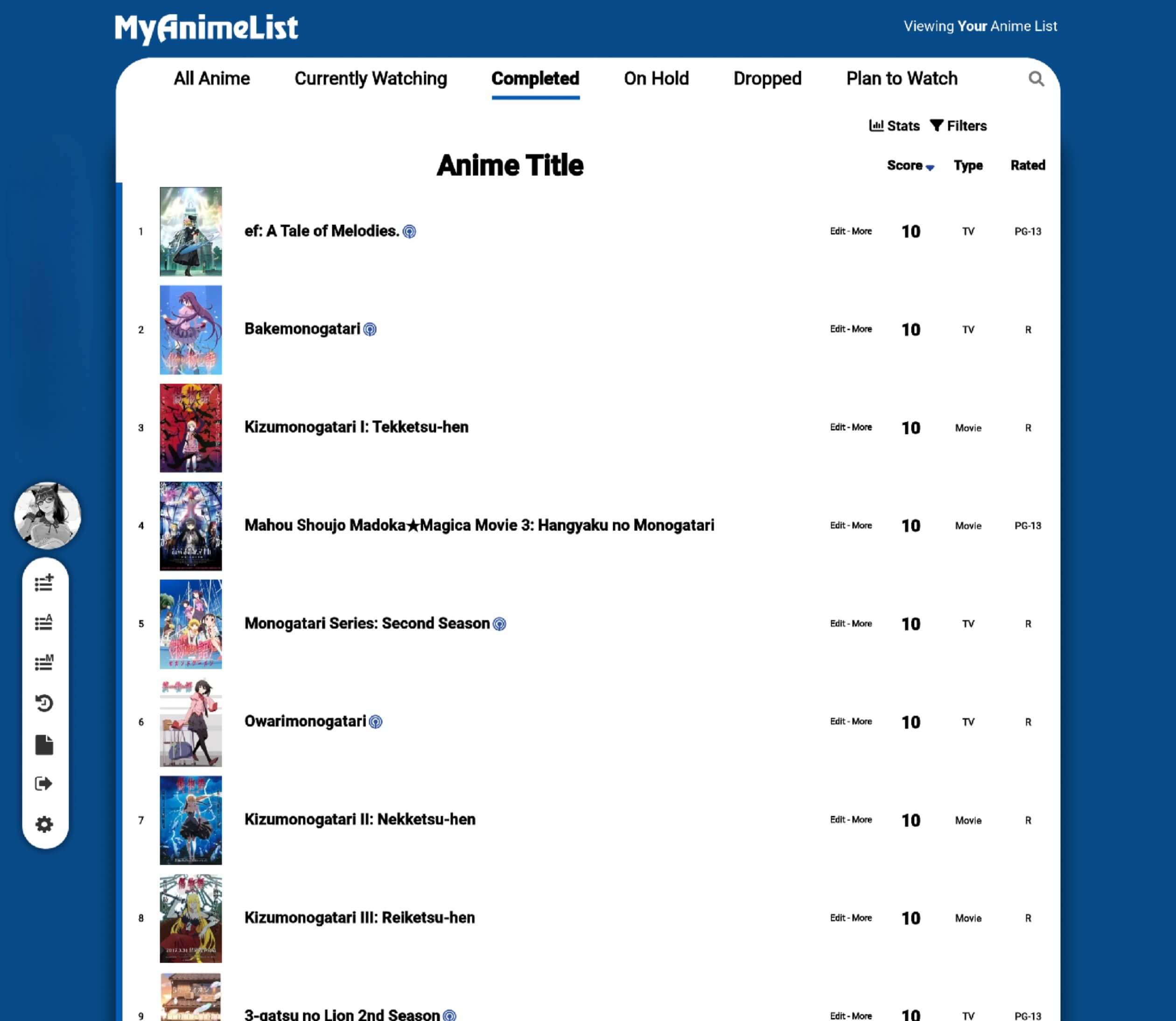 MaterialMAL
created by StressedNekoIf you realize, I haven't used any Header Image or Background Image because I don't like clutter. The inspiration comes from Google with "Material Design", which seeks to reduce all clutter and do something completely minimalist/aesthetic for my eyes.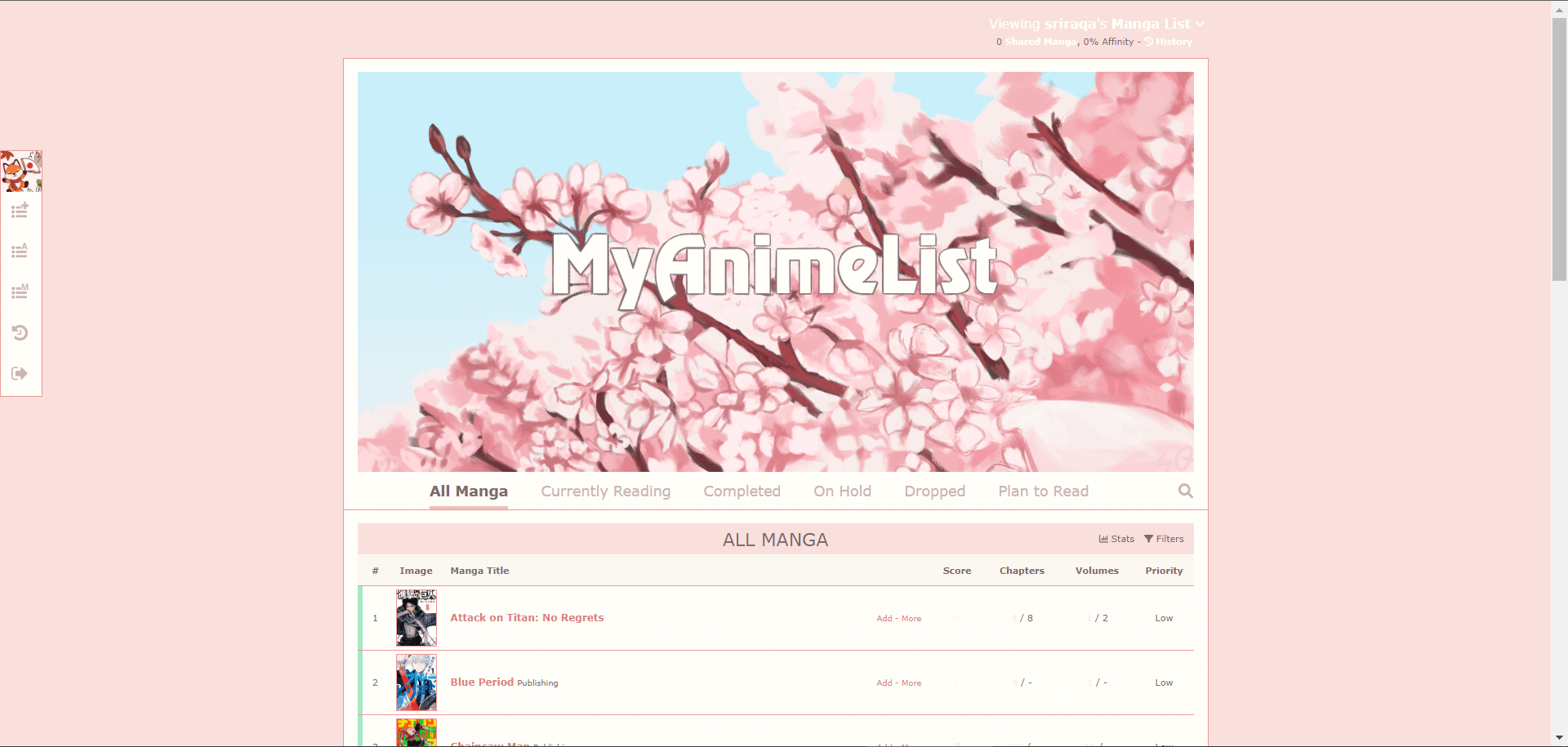 Cherry Blossom
created by sriraqaA pastel design that uses colors inspired by Japan's cherry blossom trees.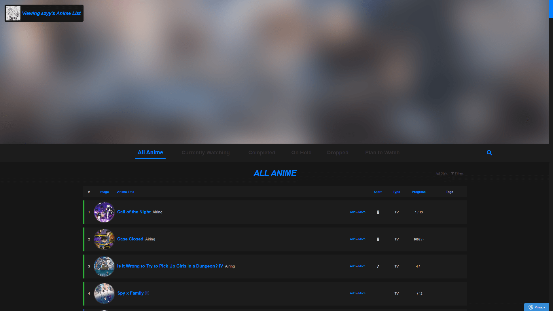 Shinpuru
created by szyven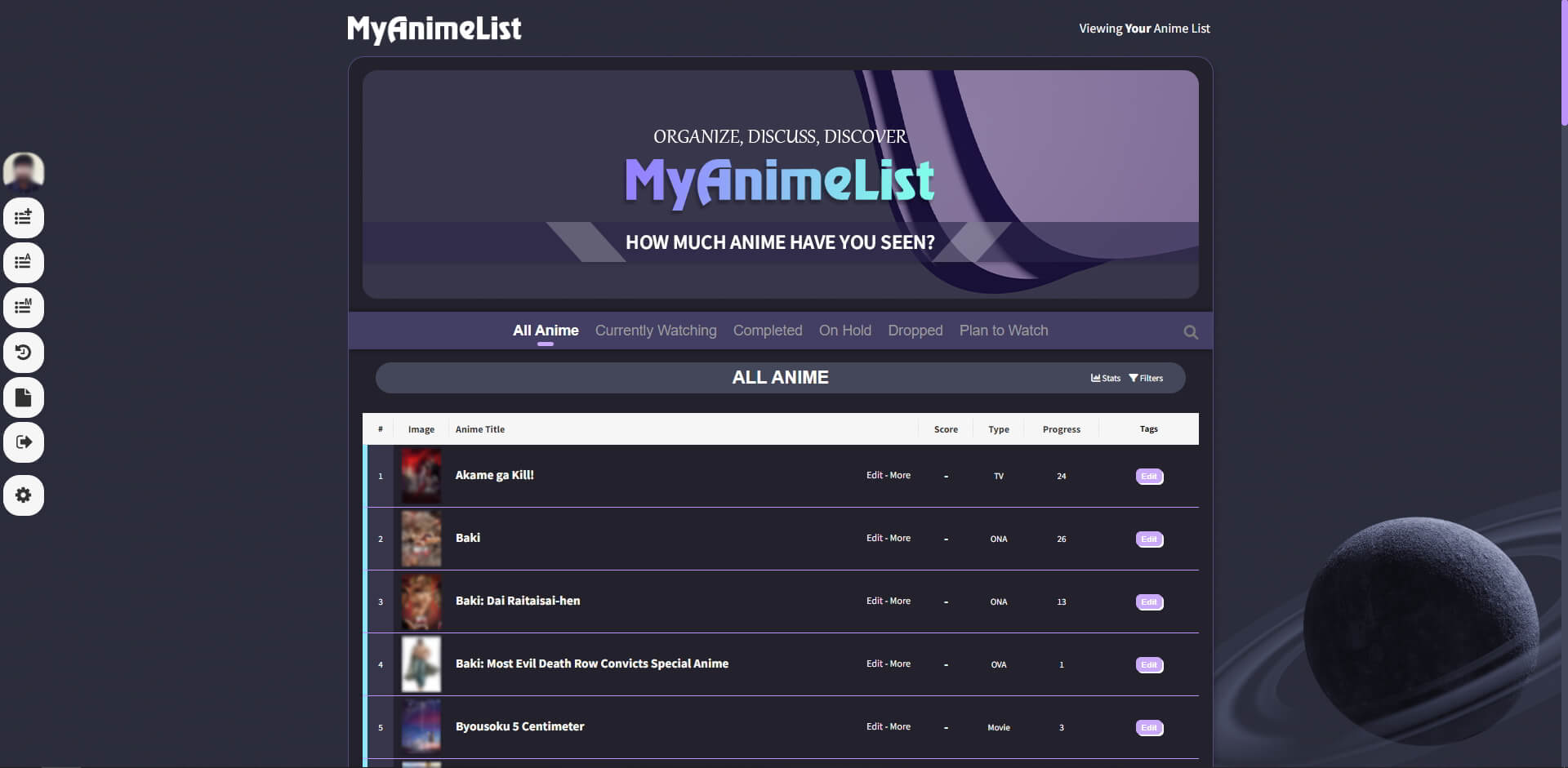 Count Dracula Theme
created by re4nightwingCount Dracula is a theme for users who lurk in the dark. (like me) Why? It'll save your eyes from too much light at 3 am and looks fantastic. The Color palette inspired but the open-source Dracula theme for text editors. I hope you guys like it.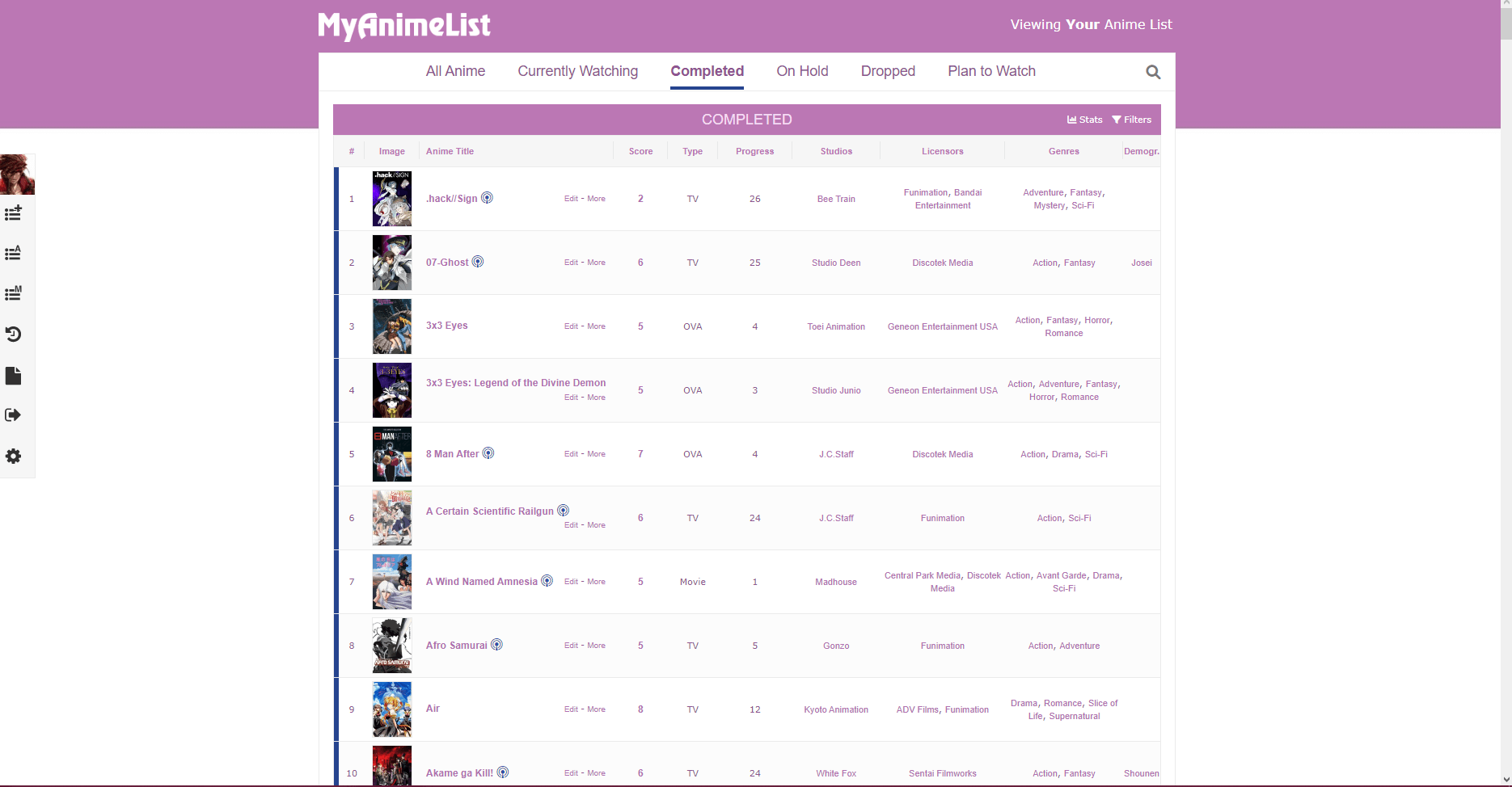 Purple-eyed kitten
created by Shishio-kun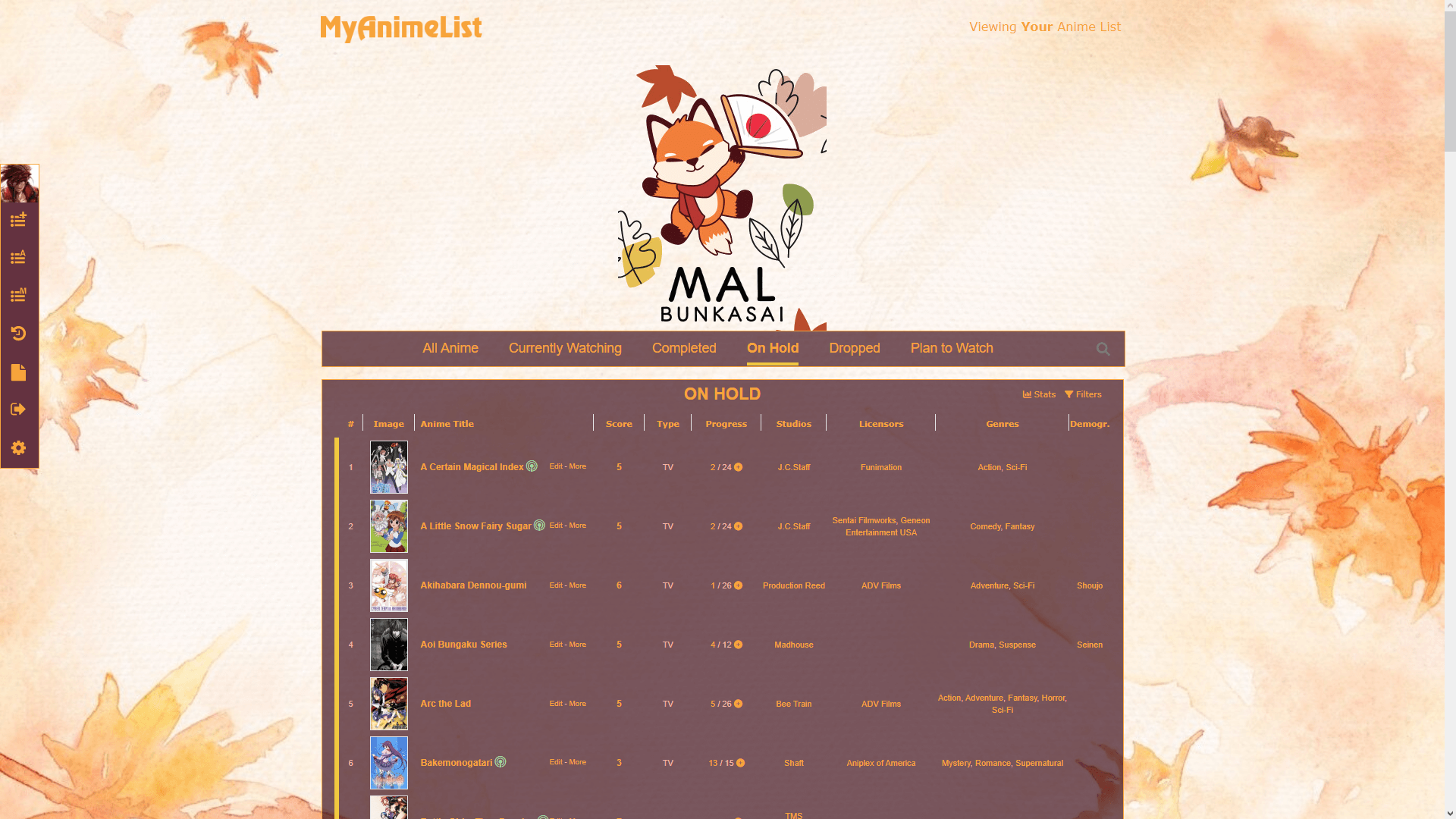 Autumn Drinks
created by Shishio-kun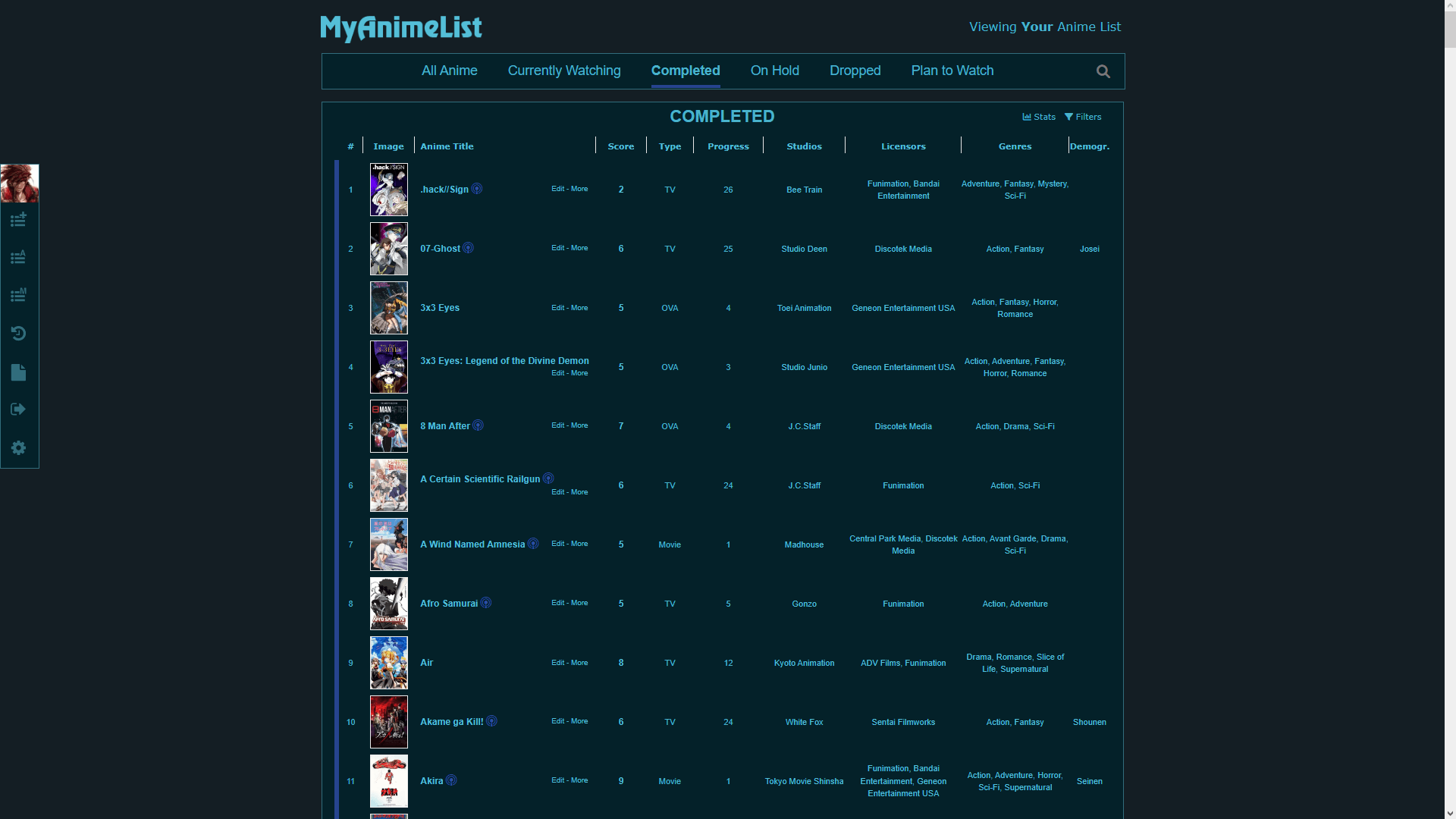 Dark Reading
created by Shishio-kun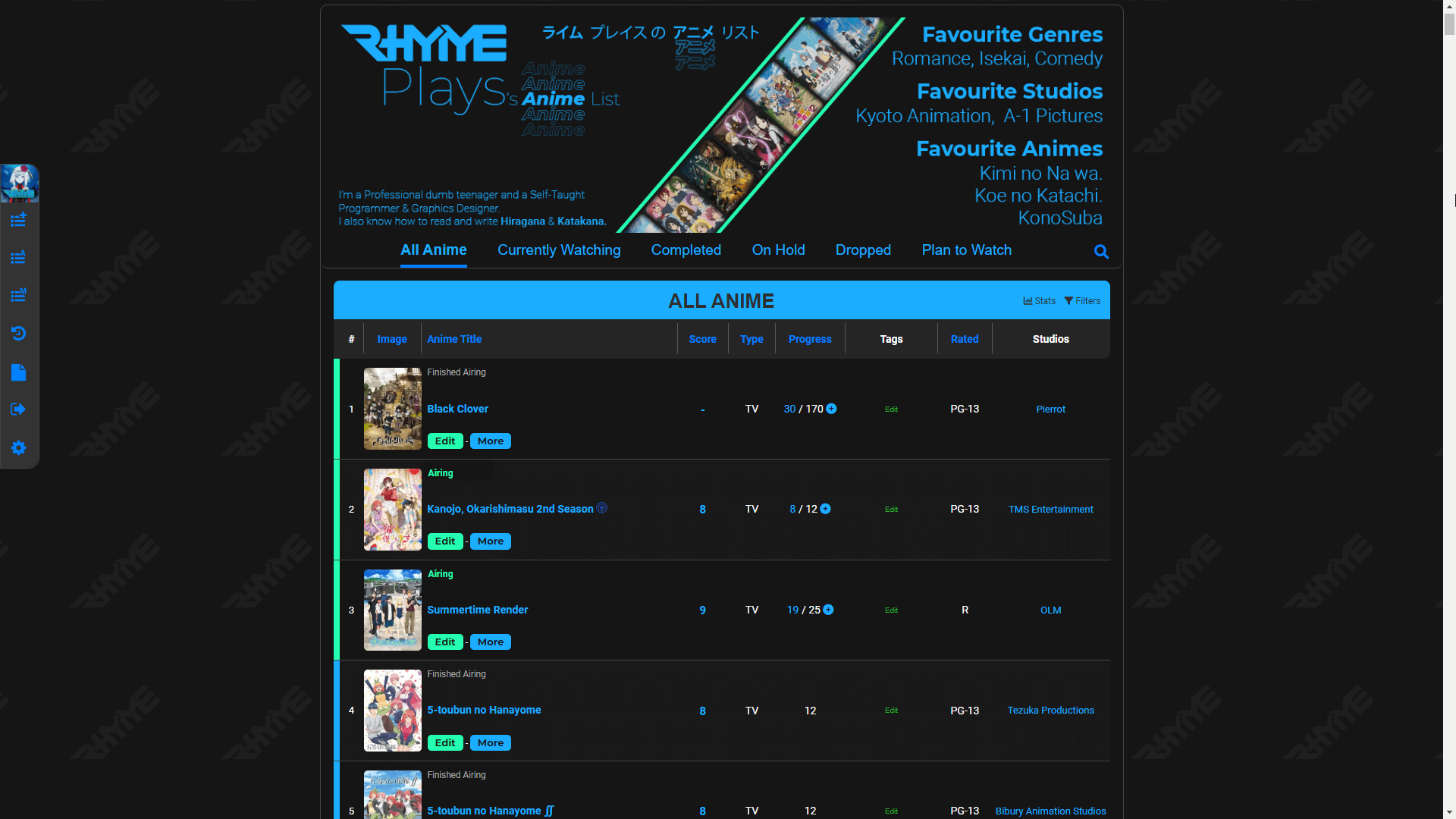 Dark Blue Revised
created by RhymePlays Modern theme - Dark Mode
created by Gintoki-AMVsA modern redesign of the current theme using current design principles. The design includes both a dark and light mode. Also, the prompts which can come up inside the list are redesigned (if the admin applies the stylesheet to the pages inside those iframes). I hope you like it!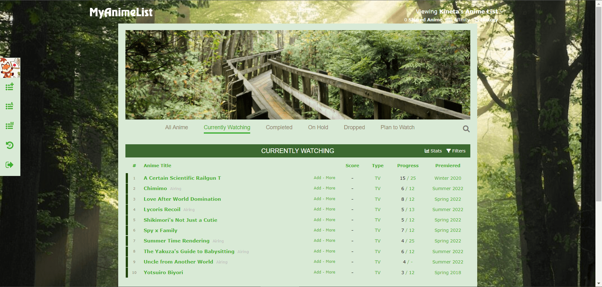 Nature Walk
created by KittacTake a trip into the forest with this nature themed design.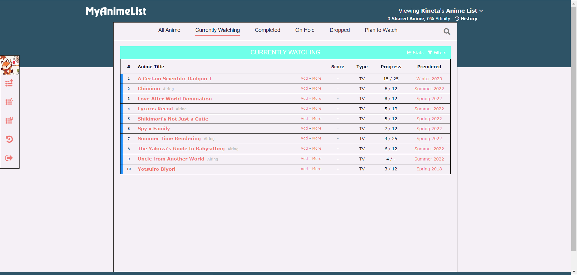 Dreamy Sky
created by Luply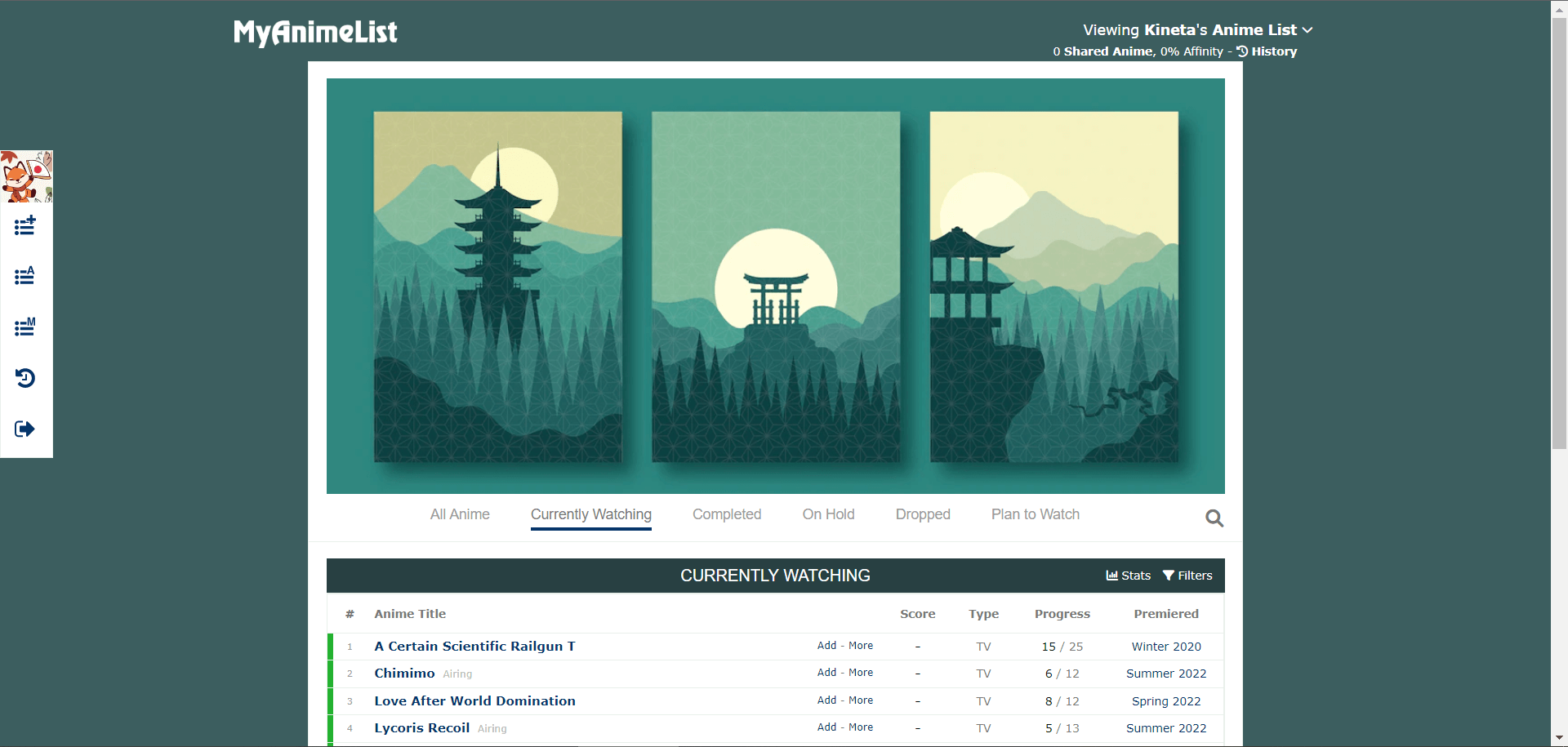 minimal-jap
created by yamasaki-kunminimal theme with an aesthetically pleasing color palette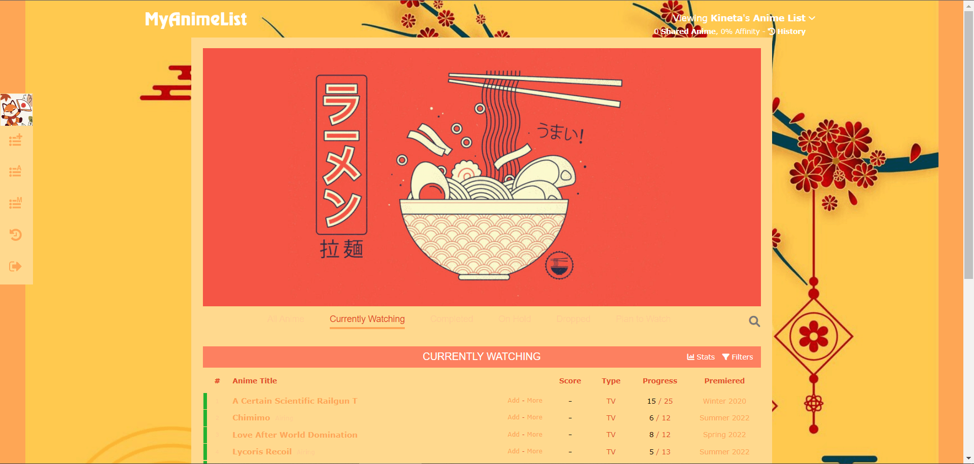 Japanese Ramem Restaurant under the tree
created by Rawby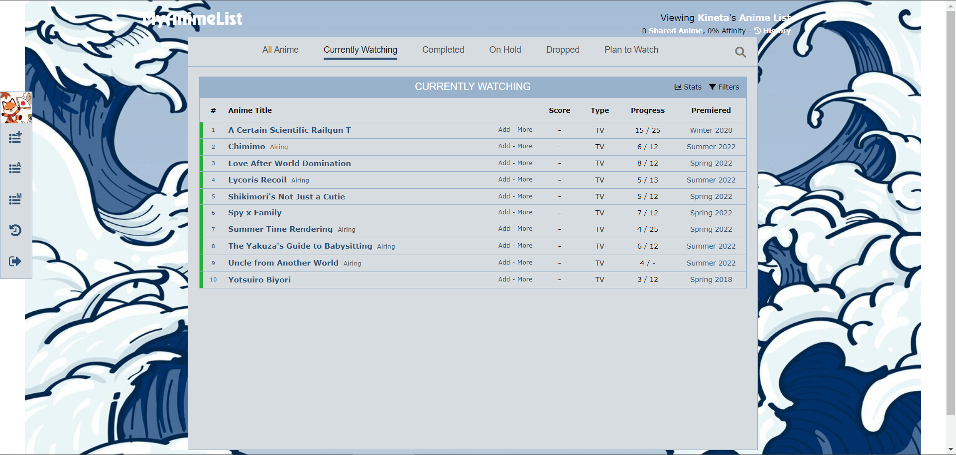 Waves time
created by Aru_ackerman_uh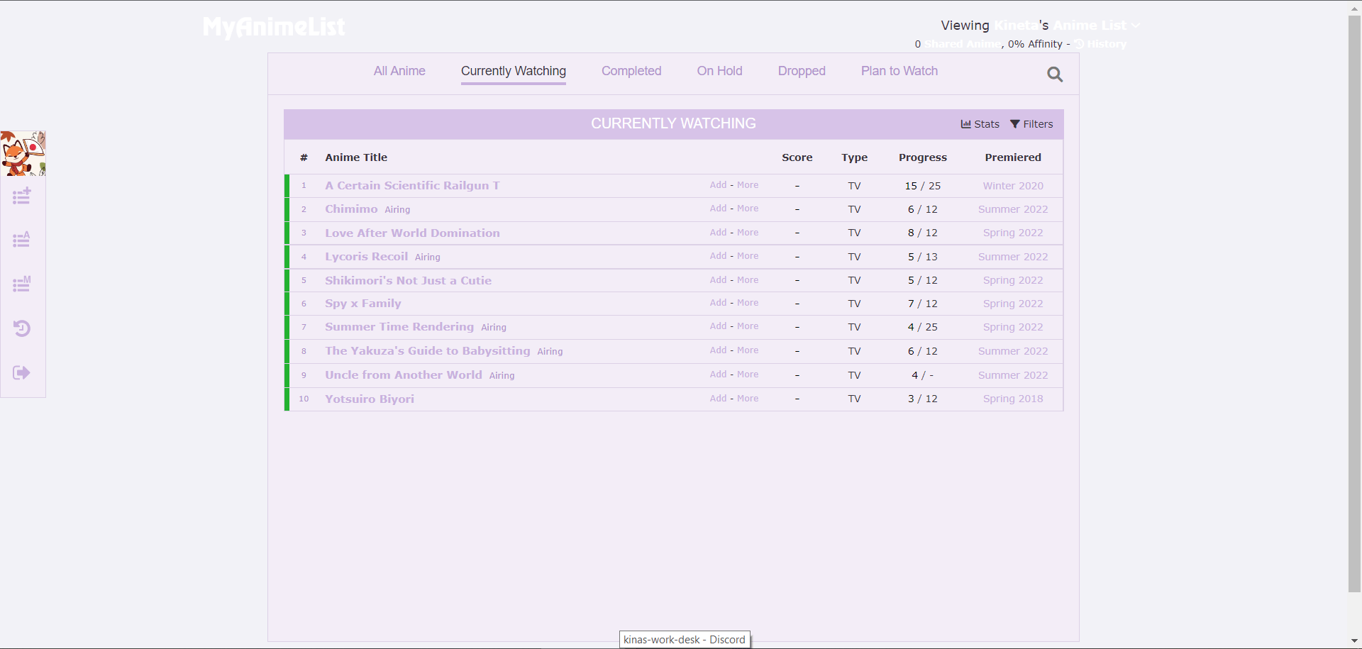 periperi-winkle
created by krmnnnSimple, minimalist and light color design depicting periwinkle tones, a color that goes with every season but that also is related to the color of the year 2022 (although it's not the same exact one).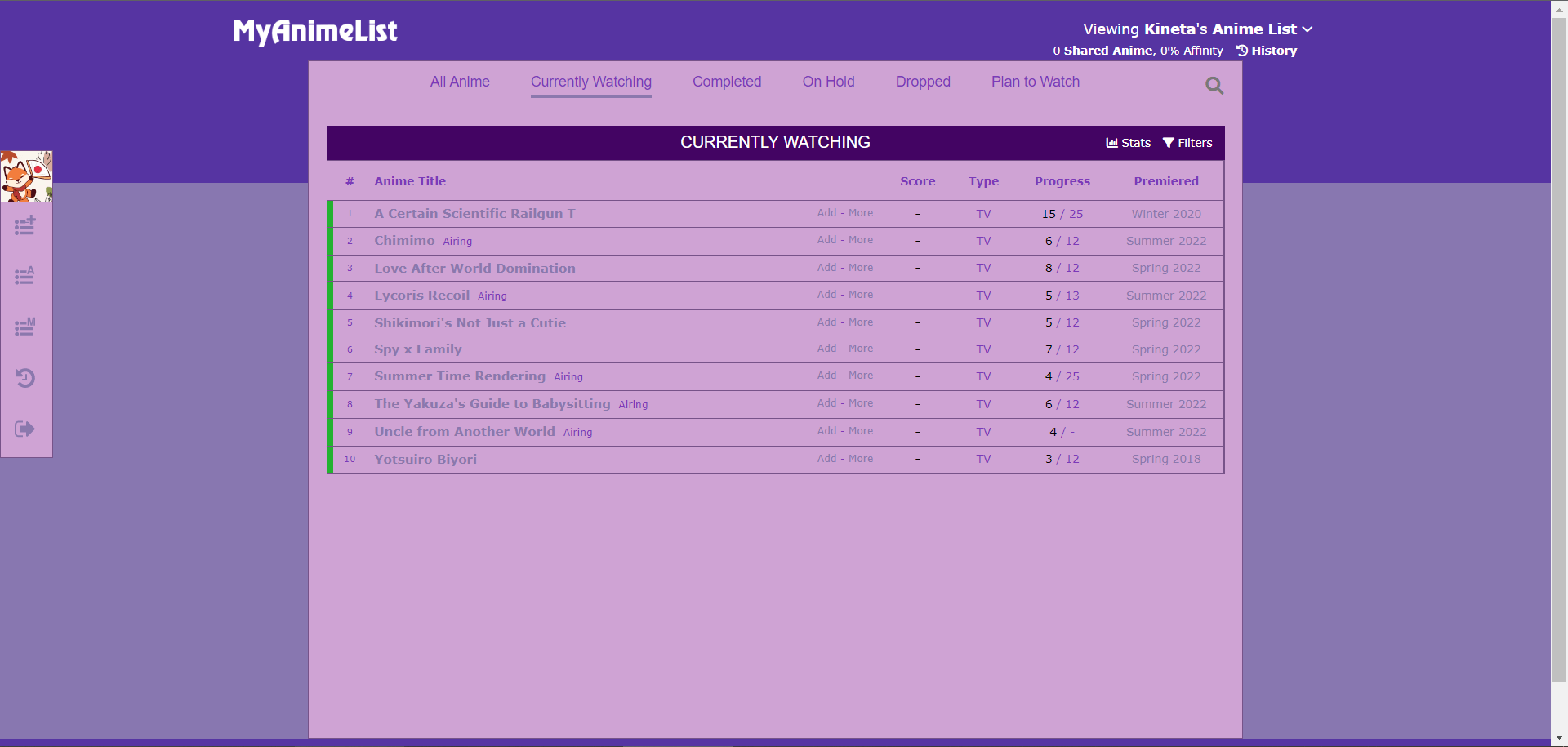 Empire Trim
created by Cv412Something purple-ish, because purple is easier on my eyes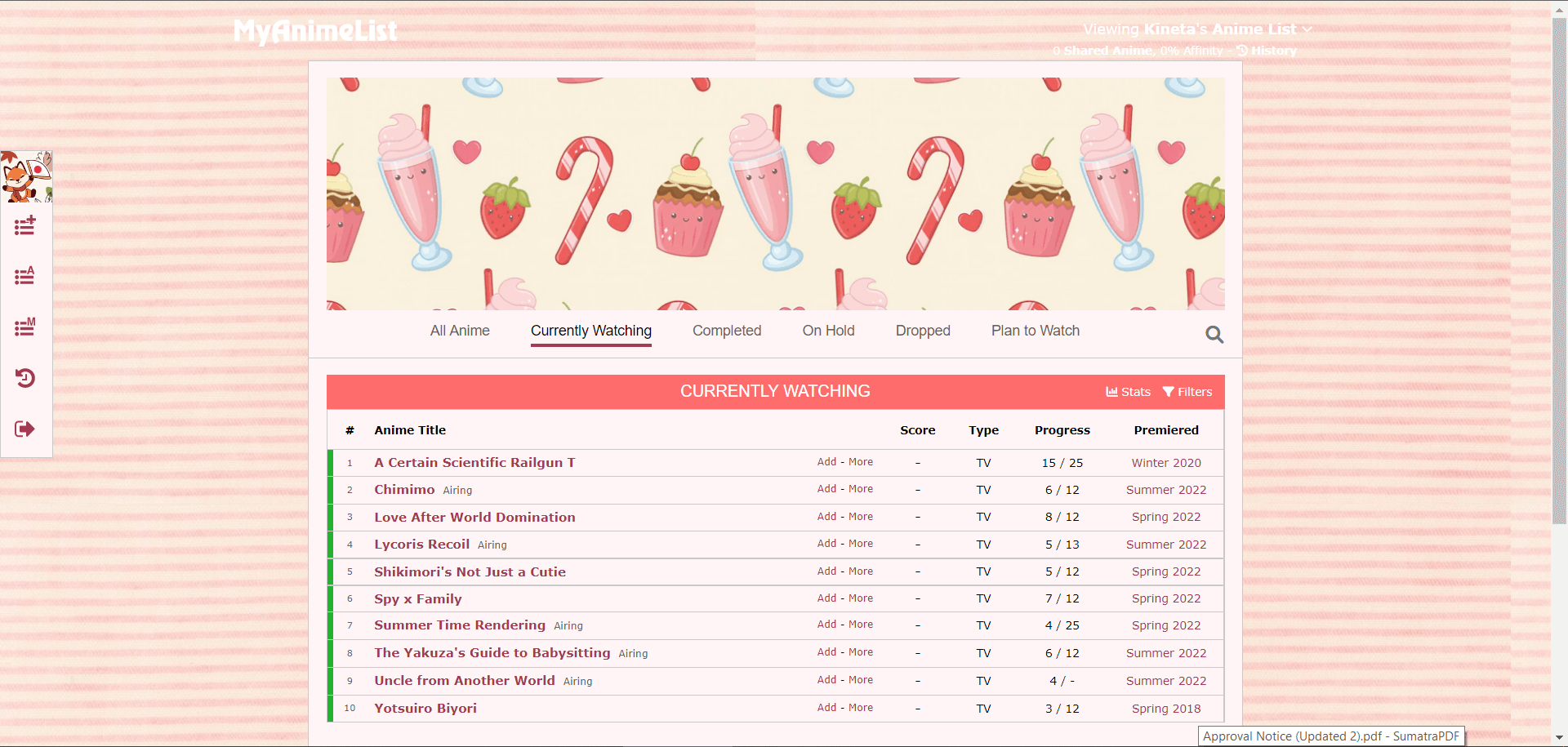 pink candy
created by AlienkyonOWO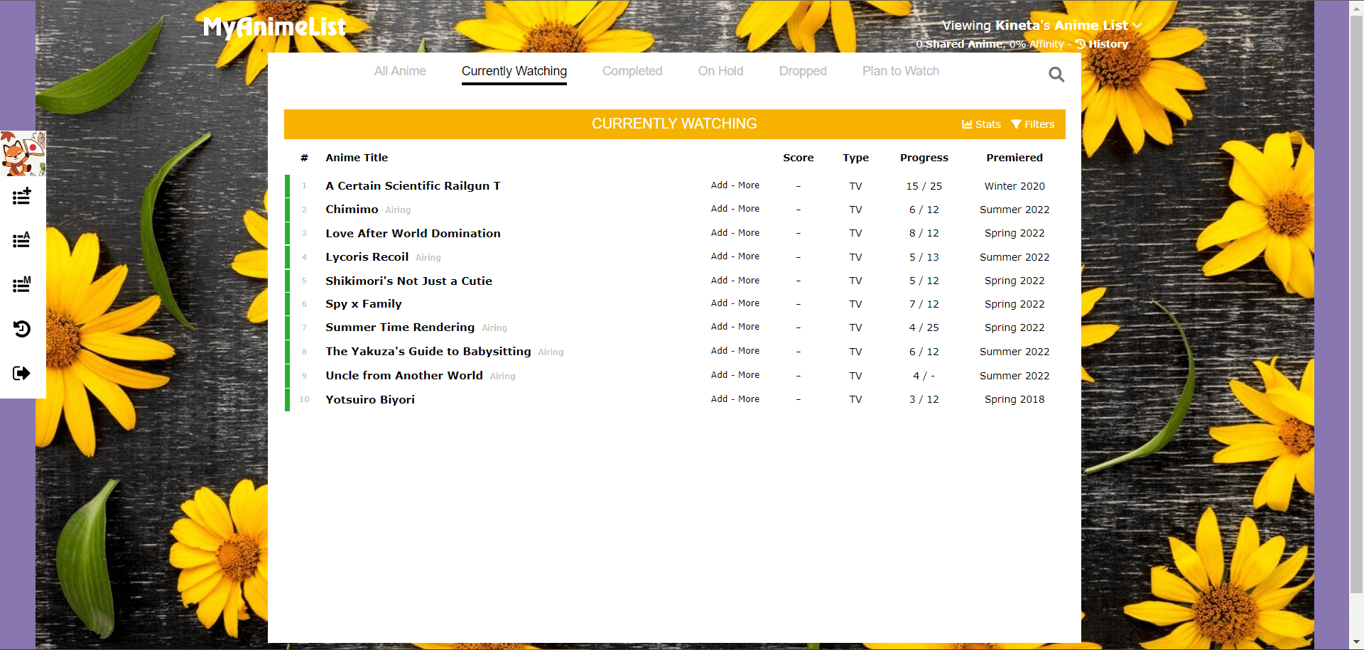 Summer Fall
created by RowLLiOx-eye daisy on a yellow background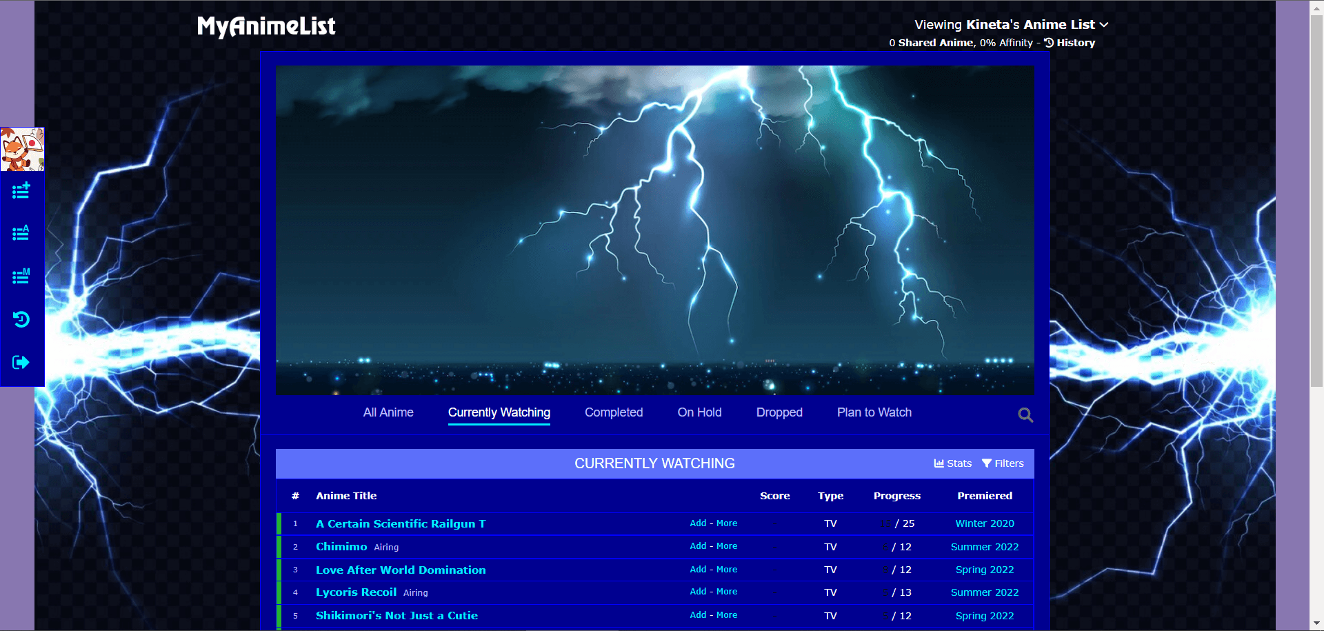 Stormy Night
created by xXFlaneXxProIt is often accompanied by thunder and lightning. On a stormy night, the sky is overcast with clouds. Rains poured in torrents. The wind blows violently from all directions.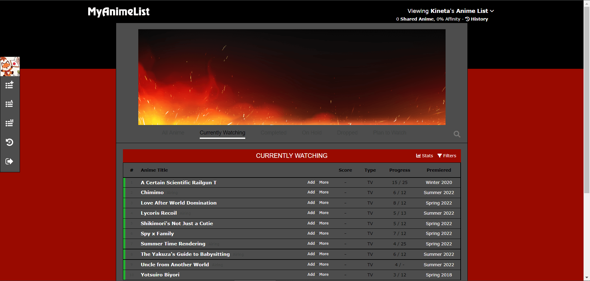 Fire
Fire
created by VelidoxFire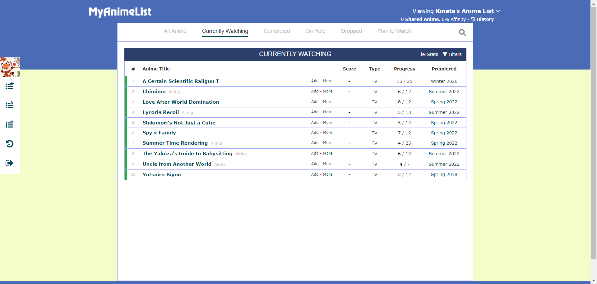 Soothe World
created by ASaltyIcePlease message me any questions or ideas, have some experience with Digital Art, would love to make more pages like this for MAL to look more professional! Sort of hard to pick colors without being able to visually see the page.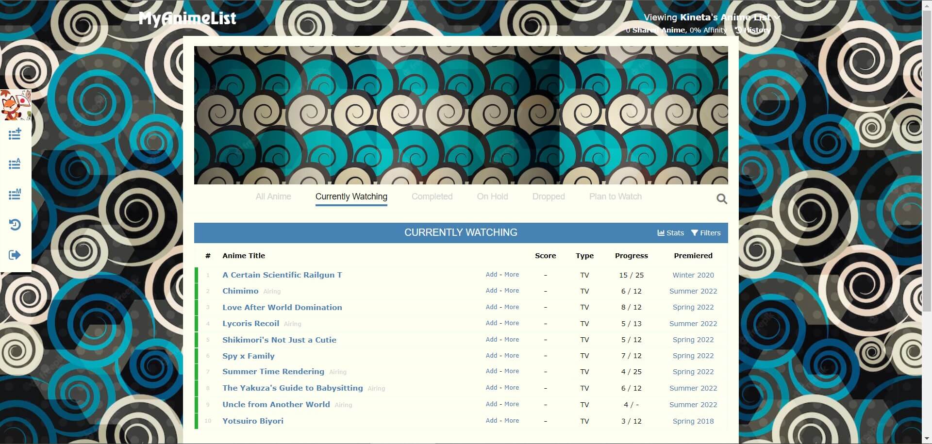 Cloudy Blues
created by YesIamXDI tried to make a combination between the background colours and the actual text and filling of the main department. I tried to also not have a shade of white through on places where white fit, whereas I chose slighty different shades of white who adds a little bit of disparity. The steel blue seems to work amazing with this colour!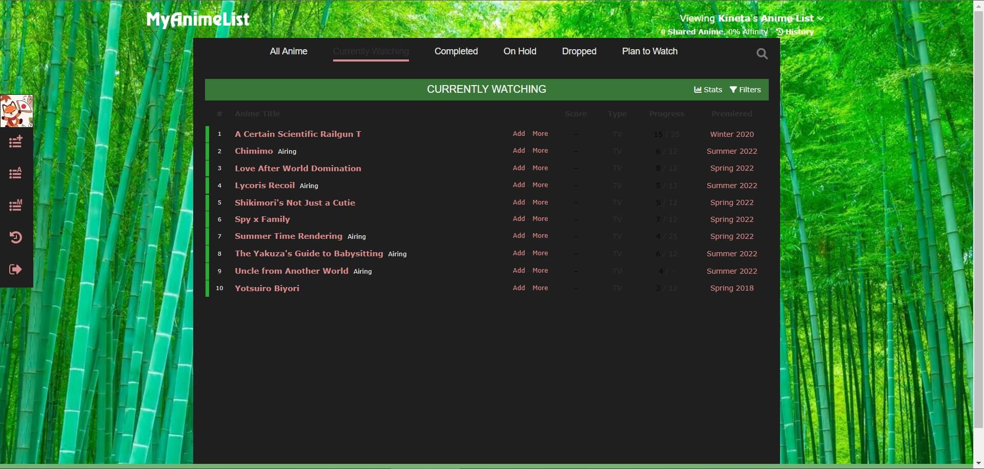 Bamboo Grove
created by MoreThanLuckA nice refreshing theme.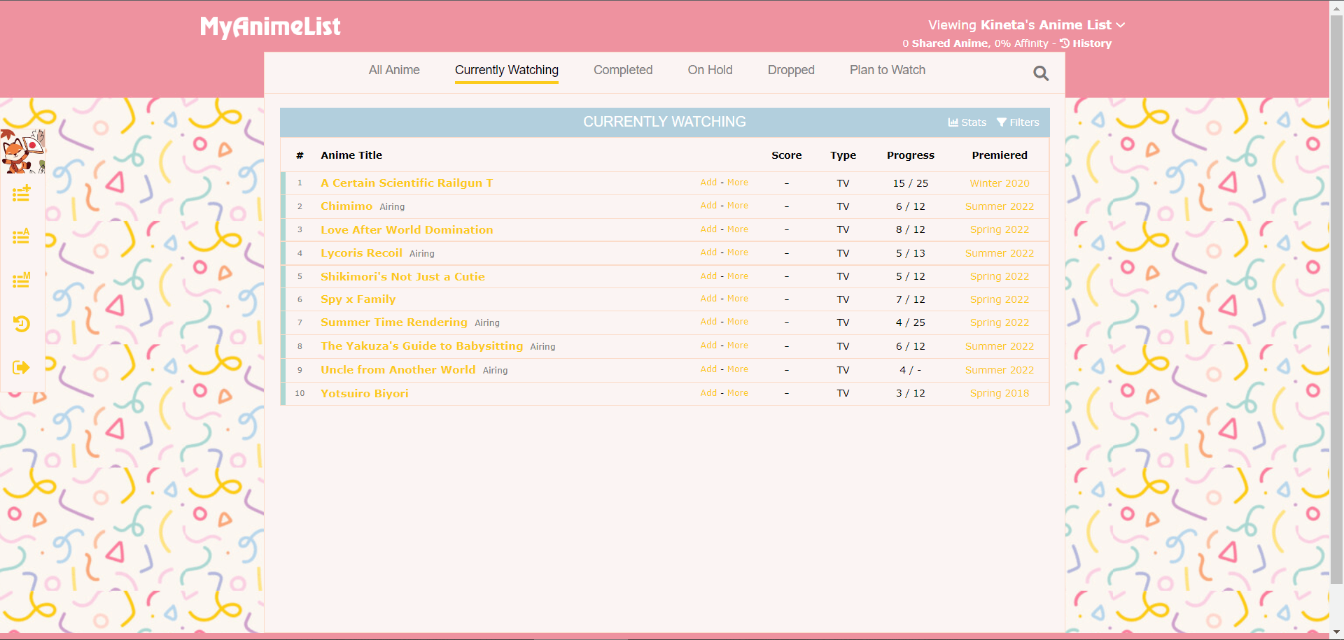 Confetti
created by mayaxiii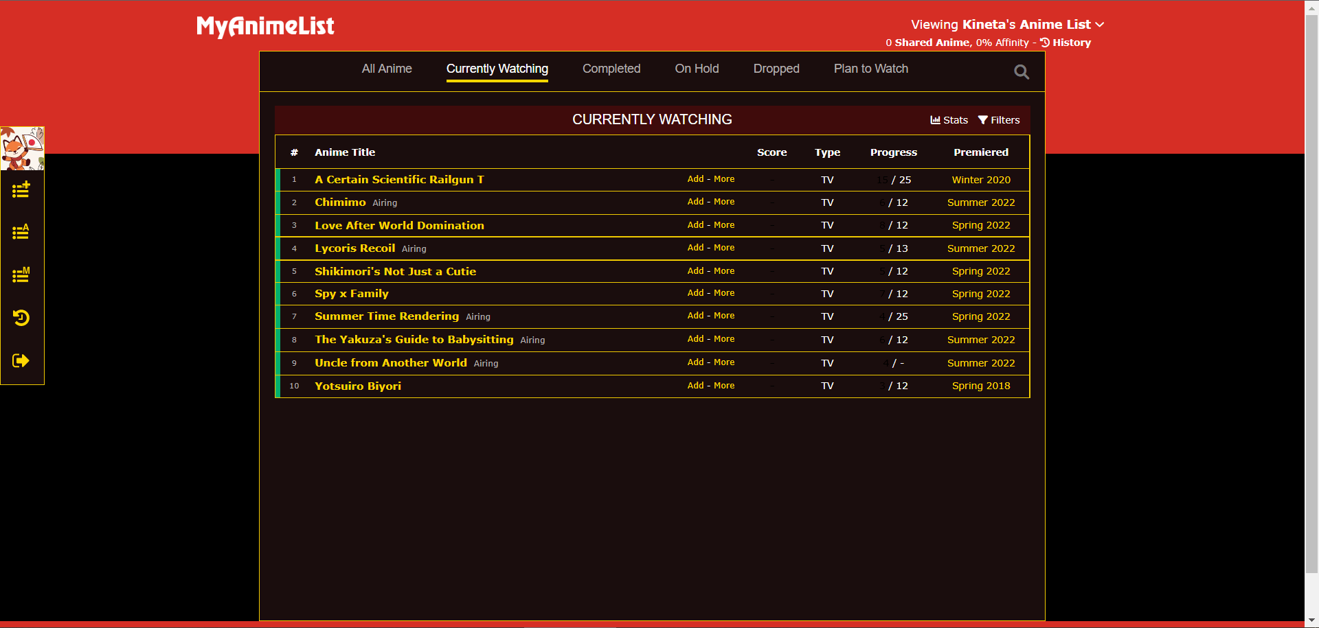 Raw Metal Theme
created by re4nightwingColor palette inspired by Fullmetal Alchemist: Brotherhood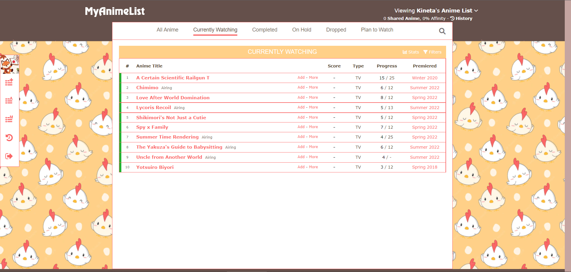 Tiny Roosters
created by senchuart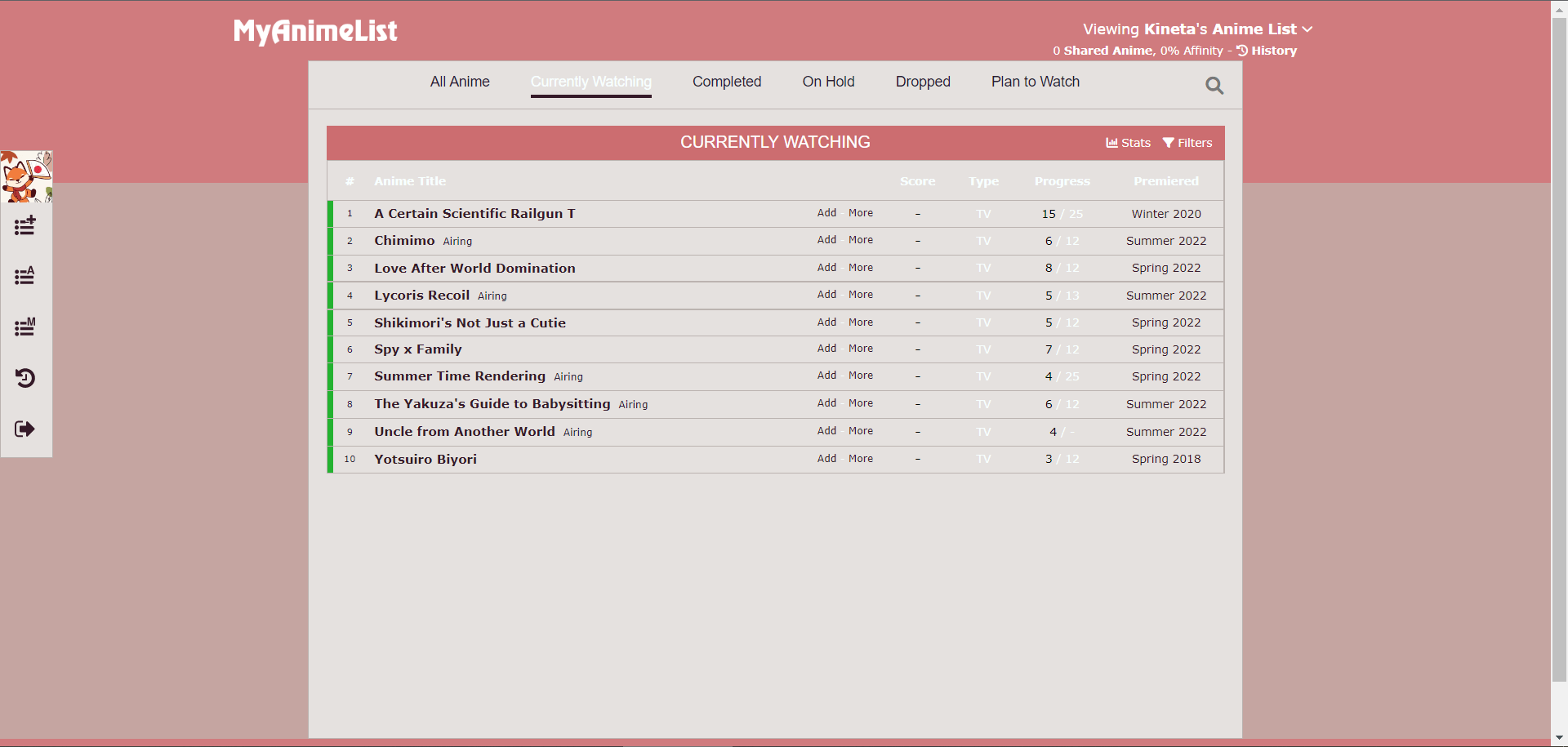 Blood Kaijin
created by SanGosh
 Projects
You Should Read This Manga 2025
You Should Read This Manga is a yearly manga discovery list created for (and by) the international fan.
 Projects
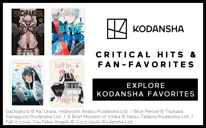
Kodansha Critical Hits & Fan-Favorites
Kodansha—purveyors of some of the most exciting and heart-felt manga published today, like Blue Lock, A Sign of Affection, WIND BREAKER & more—prides itself on having an expansive library of stories and genres.
 Projects
Learn how to draw anime & manga from Japanese pros!
It’s time to learn how to draw anime and manga! Learn how to draw via easily-accessible online videos and get personalized advice from pros in Japan.

